Guide to Product Design Services
Launching a new product is equivalent to the new company. When every company is competing for devoted consumers, the product design process is essential for standing out. In today’s world, we live in a consumerist culture.
Product design has become more important than ever before as our society has developed increasingly globalized. While we still have a fundamental requirement for products and services, what we desire is a different story.
To take benefit of our PerfectionGeeks Technologies services , great product design takes advantage of both our needs and desires. The market is swamped with similar products and services, and the only thing that differentiates one brand of a certain offering from another is the design.
However, getting into the product designing procedure is risky. It needs serious planning and organization.
This guide will summarize the key steps of the product design life cycle. Moreover, product design is the beginning of a new business way, and this guide will help make this star successful.
Product page design best practices

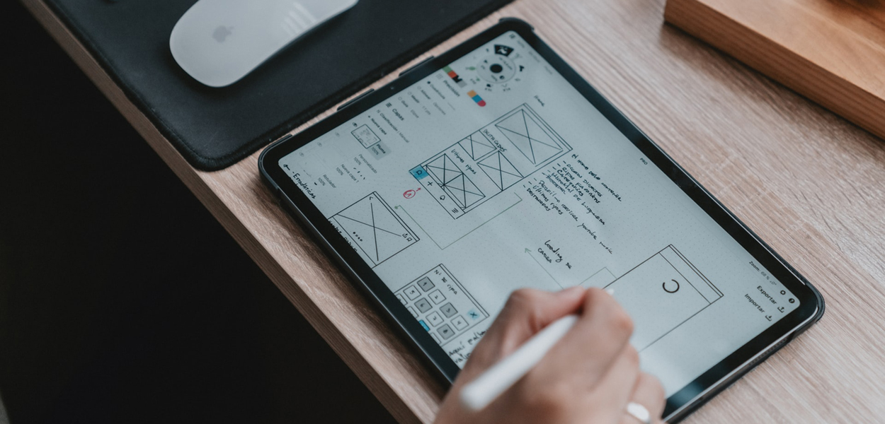
Use the right product page design software
The design procedure will commonly start with a brief or a list of the essential elements. Most designers will then transition to pen-and-paper sketches to develop ideas for how the components will fit together. This is referred to as a wireframe—a simplified, skeletal model of the page structure. Once you’ve checked these down, you must move on to software.
Prototyping apps and developing more sophisticated mockups, giving you a more exact representation of how the page will look. Makes interactive prototypes, which speeds up the testing procedure.
The advantage of prototyping apps is that they let the designer focus solely on user experience early on. They also manage to lead to less original designs. While this can often be preferable—the plan is a seamless shopping experience—if you like to create more innovative designs, textures, or animations, you’ll require software like Photoshop and After Effects.
Use a template-based layout approach
Considering an E-Commerce site will have multiple products, tailoring a product page to every single item is not possible. Most developers aim for template layouts, creating adding new product pages as easy as copying and pasting content. One strategy is to use a single template for all product pages or else slightly different templates for different product combinations.
Template-based structure needs planning: marketers and copywriters will have to dedicate a consistent number of images, feature lists, Q&As, testimonials, etc. for every product. At the same time, product page templates don’t always have to be 100% similar. For instance, if the color will vary between products, the color scheme of the product page can be varied to match.
Many product pages these days have fairly standard layouts even across other organizations. For instance, e-commerce sites tend to show images on the left side with the product description, customization options, and CTA on the right. Below this comes a list of specifications and advantages, followed by the FAQs and reviews/testimonials.
The strength of a ubiquitous design like this is its familiarity: most visitors will intuitively know where to find the details they’re looking for. Its straightforwardness is especially ideal for buyer/seller platforms (like eBay) where the brand will have no authority over the product images and copy.
Design with the rest of the website in mind
Of course, product pages are not created in isolation: they have to combine with the rest of the website. Consistency like this is essential not only for branding but because a discordant product page can seem subconsciously less trustworthy to the prospective purchaser.
Constraining product pages to the existing branding can also give a challenge for designers. Let’s say a branding team has decided for some irrelevant reason to use black-and-white filters for all images—now the product page will be off-brand if it highlights an item’s colors. This is why e-commerce businesses that prioritize online shopping should begin the web layout method with the product page layout.
At the same time, authorizing the brand qualities to shine through the product page can also guide to creative liberties—the “hoodie” design pictured here gives a clear sense of the brand’s attitude. But it’s also never too late to believe a complete site redesign if it allows optimizing the product page.
Similarly, the checkout page is often an extremely simplified version of the product page, showing the key product image in miniature, the price, and the quantity with options for making changes.
Considering almost 70% of shopping carts are abandoned, checkout time is an ideal opportunity to display advantages listed on the product page such as shipping times and low fees. Overlaying the checkout page on top of the product page will also make it more comfortable for the user to click out to go back, rather than potentially leave the website.
Selectively prioritize data
Product pages must balance informing the prospective buyer without overwhelming them with details. This tells the developer must make decisions about what the user has to see and when.
Part of this has to do with what content is set about the fold. But the specific design methods (such as size, color, and font style) that established priority are summed up in the principles of visual hierarchy.
What data is prioritized can rely on what you are selling. For aesthetic products like apparel, furniture, artwork, etc, the product image is going to be the primary selling point. For the services or the products that lack visual elements, the description defining the product that will take priority.
You can always count on the CTA to be a high priority in any context, but that doesn’t imply you have to go overboard with a loud color or an oversized button. One of the major strategies for designing CTAs is making a contrast against the other page elements.
Finally, eye tracking via a tool like Crazy Egg can help you to determine more scientifically what parts of the page draw your user’s attention (especially helpful when their concentration is reaching where you don’t want it to).
The major process for prioritizing details is to condense or collapse secondary content. This is particularly common in FAQ sections, where a list of queries will be displayed and the user will have to press a button (often a plus or triangle icon) to see the answer.
Similarly, carousels can be utilized to show a particular sample of content (such as images or customer reviews) within a narrow, horizontal section, allowing the user to swipe through for more.
These approaches not only keep the site from feeling too cluttered, but they also invite interaction—keeping the visitor engaged as opposed to passively reading.
Tell a story with images
Images are inevitably the most eye-catching aspect of a product page design for the simple reason that they are quicker to scan than text. It’s likely no wonder that online shoppers these days expect to see an average of 6 images and 3 videos on product pages.
At the same time, images on product pages must be more than attention-grabbing: they have to create a digital product that feels real. This implies that the images should form an experience of the product, telling a story without words.
How pictures do this can depend on the product. For physical products, dimensions are often important, and this applies more than showing the measurements. With furniture, for instance, an image that displays the product in a fully equipped room not only gives the consumer decorating ideas, but they can also compare it to nearby things for a better sense of scale.
Apparel brands will commonly use models to showcase the fit, but they can also go the extra mile to display models in detailed settings, hinting at a possible future that could accompany the purchase. For products or services without a visual component, designers have to be more innovative, using images that evoke the experience of using the product.
Additionally, using icons or simplistic illustrations to accompany a how-it-works section can easily summarize the steps of the method for visual learners. For this approach, take inspiration from infographic designs to get an idea of how to filter complex data through images.
Don’t underestimate user-generated content
Although it can be your first instinct to handle every element on the page, making room for user-generated content is worth the chaos it might invite. Commonly, this indicates allowing users to submit their own general reviews, queries, and pictures of the product.
This can seem like a developer’s nightmare: illustrations will almost certainly be poor quality and the occasional angry review is inevitable.
On the other hand, users authorize other users far more than they trust the curated pictures and testimonials that a brand gives. Trust like this can make or break a purchase. That is why user-generated content is typically saved for the bottom of the page when the visitor has presumably gone through all the official details and is deliberating on their final decision.
When it comes down to it, average positive reviews will outweigh negative outliers in most consumers’ minds. Additionally, these areas can be an option for brands to respond to questions and negative comments, showcasing their personalized care and consumer service.
Conversely, neglecting to contain content like this can be perceived as a lack of confidence or as though the seller has something to hide. To make the sale, authenticity can be more essential than a perfect-looking product page design.
Test, analyze, and iterate
We can offer you advice on acquiring a great design, but we can’t tell you whether your final product page will be a success. But we know who can: your audience. In other words, the success of your product page relies on whether analytic tools like Glew or Google Analytics’ Enhanced Ecommerce show that people are buying.
Some key metrics to pay attention to are our traffic and their sources, session data, and of course conversion rates. The tricky part of this procedure is getting to the root of any issues since it is not always going to be the structure that is at fault.
A high bounce rate or lack of interaction (including scrolling) may suggest that the page is uninteresting at a glance.
Meanwhile, a high cart abandonment rate could indicate the checkout procedure is too cumbersome (or that there are unexpected costs). When visitors do not proceed to the cart phase at all after a long session, this may point to unpersuasive copy. And if a page is getting low traffic, you might want to revisit your SEO strategy.


