
Challenges and Opportunities of Responsive Web Design in Germany
January 20,
4:30 PM
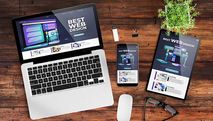
Responsive web design has become a cornerstone of modern web development, ensuring websites adapt seamlessly across various devices (desktops, tablets, and smartphones).
In Germany, a technologically advanced nation with a strong emphasis on user experience, embracing responsive design presents both unique challenges and exciting opportunities for businesses.
Challenges:
- Meeting German Accessibility Standards: Germany has stringent accessibility laws (Barrierefreiheitsgesetz - BfG). Websites must be accessible to people with disabilities, including those with visual, auditory, motor, and cognitive impairments. Responsive design plays a crucial role in ensuring accessibility across all devices. However, ensuring compliance with German accessibility standards can be complex and requires careful consideration of factors like:
- Keyboard navigation: Websites must be fully operable using only the keyboard.
- Sufficient color contrast: Text and background colors must have adequate contrast for readability.
- Alternative text for images: Descriptive text must be provided for all images to aid screen readers.
- Focus management: The website's focus should be easily and predictably managed using the keyboard.
- Catering to Diverse German User Preferences: Germany boasts a diverse population with varying preferences and expectations for online experiences. Understanding these nuances is crucial for successful responsive design. Factors to consider include:
- Regional variations: Design choices may need to be adapted to cater to specific regions within Germany.
- Age demographics: Older users may have different expectations and needs compared to younger generations.
- Cultural considerations: German users value clear and concise information, and a minimalist design approach often resonates well.
- Staying Ahead of Technological Advancements: The digital landscape is constantly evolving. New technologies and devices emerge regularly, necessitating continuous adaptation and optimization of responsive designs. Staying abreast of these advancements is crucial for maintaining a competitive edge.
Opportunities:
- Enhanced User Experience: Responsive design provides a consistent and seamless user experience across all devices. This enhances customer satisfaction, builds brand loyalty, and improves overall website engagement.
- Improved Search Engine Optimization (SEO): Google and other search engines favor mobile-first indexing. Responsive websites are inherently mobile-friendly, which significantly boosts their search engine rankings, driving more organic traffic to your website.
- Increased Conversions: A responsive website ensures that visitors can easily navigate and interact with your website, regardless of the device they are using. This can lead to higher conversion rates, whether it's making a purchase, filling out a form, or subscribing to a newsletter.
- Cost-Effectiveness: Maintaining a separate mobile website can be costly and time-consuming. Responsive design offers a cost-effective solution by providing a single, adaptable website that works seamlessly across all devices.
- Competitive Advantage: By embracing responsive design and prioritizing user experience, businesses can gain a significant competitive advantage in the German market.
Conclusion
Responsive web design presents both challenges and opportunities for businesses operating in Germany. By carefully considering accessibility guidelines, understanding German user preferences, and staying ahead of technological advancements, businesses can leverage responsive design to create engaging and successful online experiences.
If you're looking for a reliable Web Design Company in Germany to help you create a responsive and user-friendly website, consider partnering with PerfectionGeeks. We have a proven track record of delivering high-quality, results-driven web design solutions that meet the unique needs and expectations of the German market.


Contact US!
India

Plot 378-379, Udyog Vihar Phase 4 Rd, near Nokia building, Electronic City, Phase IV, Sector 19, Gurugram, Haryana 122015
Copyright © 2026 PerfectionGeeks Technologies | All Rights Reserved | Policy