
Published 1 October 2026
Designs
10 Best Infographic Generators for More Control Over Your Designs in 2026
Generation Is Easy. Getting the Details Right Is Harder.
A communications manager in my network once sent me two versions of the same infographic. One had taken minutes to generate. The other had taken considerably longer to refine. The second was not dramatically more elaborate, but the hierarchy was clearer, the charts suited the data, and the visual language matched the organization's brand.
That comparison stuck with me because it exposes a weakness in how most people evaluate infographic generators. Speed and automation are easy to demonstrate in a product walkthrough. Control is harder to quantify, yet it often determines whether the generated output is actually usable.
- AI should speed up infographic creation, not remove creative control.
- Post-generation editing is essential for refining content, hierarchy, layouts, visuals, and branding.
- Choose tools based on your specific needs, such as chart customization, brand consistency, diagramming, or interactivity.
- Data visualization requires control over chart types, data, labels, colors, and formatting.
- Output flexibility matters—check export formats, resizing, sharing, and interactive capabilities before choosing a platform.
- The ideal workflow is to let AI handle repetitive groundwork while keeping important creative decisions in human hands.
Coloured, well-structured infographics can improve reader comprehension by up to 82% compared to plain alternatives. That kind of result does not come from generation alone. It comes from the editing decisions made afterward.
For this guide, I am looking beyond what each platform produces automatically. The better question is what you can change afterward: typography, layout, charts, imagery, branding, individual sections. The best infographic generators give you enough control to make deliberate design decisions without giving up the efficiency that made generation useful in the first place.
Top 3 Quick Picks: The Best Infographic Generators
Piktochart: Best for Post-Generation Editing
- Editable AI-generated sections
- Customizable charts and visuals
- Brand styling controls
Adobe Express: Best for Visual Asset Control
- Extensive creative assets
- Generative editing features
- Adobe Fonts integration
Infogram: Best for Chart Customization
- Wide visualization selection
- Editable data-driven charts
- Interactive content options
These three stand out for different types of control. Piktochart provides extensive editing after an infographic has been generated, Adobe Express offers a broad creative environment for shaping visual assets, and Infogram provides deeper options for working with charts and data-driven content.
The full comparison looks beyond whether a platform can generate an infographic and focuses on how much influence you retain over the finished result.
How Much Control Should an Infographic Generator Give You?
Automation is valuable until it starts making decisions you'd rather make yourself. When evaluating infographic generators, look beyond the quality of the initial output and examine how much freedom you have to change it. These four areas reveal whether you're working with an editable design or simply accepting whatever the generator produces.
1. Control Over Content and Hierarchy
An infographic generator will inevitably make decisions about what information deserves the most attention. Those decisions won't always match yours.
Look for the ability to rewrite text, change headings, reorder sections, add or remove content blocks, and adjust how much space individual ideas receive. This is particularly important when AI is interpreting a longer document or brief. It may identify the correct information while giving the wrong point visual prominence. A useful generator should accelerate those initial hierarchy decisions without locking you into them. You should remain the editor of the story, even when AI creates its first structure.
2. Control Over the Visual System
Colors and fonts are only the beginning of customization. Good infographic editing should let you influence spacing, imagery, icons, backgrounds, section styles, and the broader visual rhythm of the page.
This matters because generated designs can otherwise start to look interchangeable. For professional work, you may also need to follow established brand guidelines rather than simply choosing a pleasing preset. Look for brand kits, reusable styles, asset libraries, and granular editing controls where appropriate. The goal isn't to manually design every element. It's to have enough flexibility to make the infographic recognizable as your organization's work rather than the generator's default aesthetic.
3. Control Over Data Visualization
Charts deserve particular attention because changing their appearance can also change how information is interpreted. An automatically selected visualization isn't necessarily the best one for your dataset.
Check whether you can change chart types, edit the underlying data, adjust colors and labels, and control how the visualization sits within the wider infographic. Spreadsheet imports or integrations can also make ongoing updates easier. This becomes especially important for reports and recurring content where numbers change while the basic design remains consistent. The generator can suggest how to visualize the data, but you should still be able to decide whether that suggestion communicates the numbers accurately and clearly.
4. Control Over the Final Format
Editing freedom isn't much use if the finished design can't work where you need it. Think about how the infographic will eventually be distributed and whether the platform supports that workflow.
A website graphic, presentation visual, printable handout, and interactive infographic all impose different requirements. Review available export formats, sharing options, dimensions, resizing capabilities, and interactive features before committing to a tool. Also consider whether you can repurpose the design without rebuilding it from scratch. Strong output control means the infographic isn't trapped inside the editor: you can adapt and deliver it in forms that suit the audience and channel.
10 Best Infographic Generators for Greater Design Control
1. Piktochart: Best for Post-Generation Editing
- Founded: 2011
- Headquarters: Penang, Malaysia
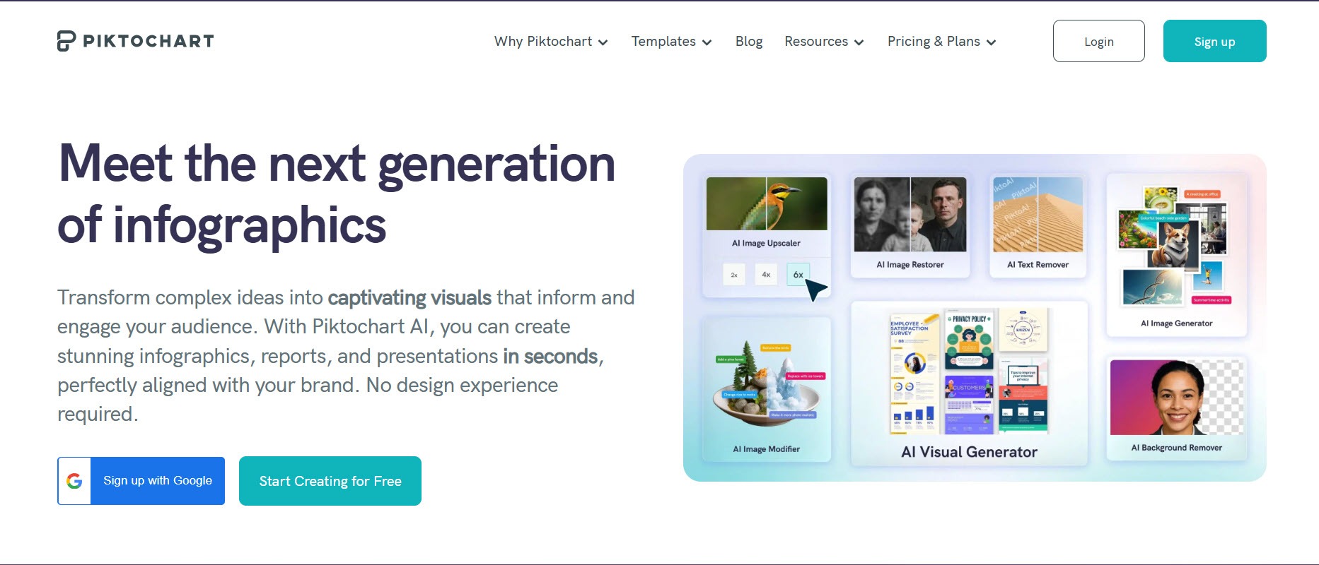
Design control is not just about having options. It is about having them at the right stage of the process. Piktochart is the best infographic generator because it preserves human judgment where it matters most, letting AI handle the initial structure while keeping every subsequent design decision firmly in the hands of the team producing the work.
Users can generate infographics from prompts, text, notes, and uploaded documents, then continue working on individual elements. Copy, typography, colors, imagery, icons, sections, and branding can all be adjusted after generation.
That matters when AI gets the broad structure right but individual design decisions still need human judgment. Piktochart also supports charts, maps, diagrams, and data imports, giving users control over the information-heavy parts of a design rather than restricting customization to appearance.
For teams working with brand guidelines, reports, or stakeholder feedback, that balance between automation and subsequent editing is particularly useful.
2. Adobe Express: Best for Visual Asset Control
- Founded: 2021
- Headquarters: San Jose, CA
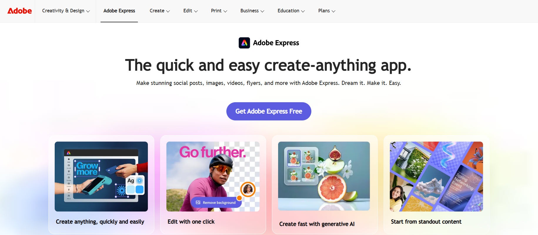
Adobe Express provides substantial flexibility around the visual ingredients of an infographic. Users can customize templates with imagery, icons, graphics, branding, and thousands of licensed Adobe Fonts.
Its generative tools add another layer of control. Users can generate templates and images from prompts, create text effects, and insert or remove objects. Charts can also be customized with different colors, fonts, labels, and branding.
That makes Adobe Express particularly useful when the infographic's visual identity requires attention. Instead of accepting the assets supplied by a generated design, creators have a broad environment for replacing and reshaping them.
3. Infogram: Best for Chart Customization
- Founded: 2012
- Headquarters: Riga, Latvia
Infogram was built around data visualization, so its strongest editing controls naturally concern charts and data. The company was founded in Riga in 2012 and is now part of Prezi.
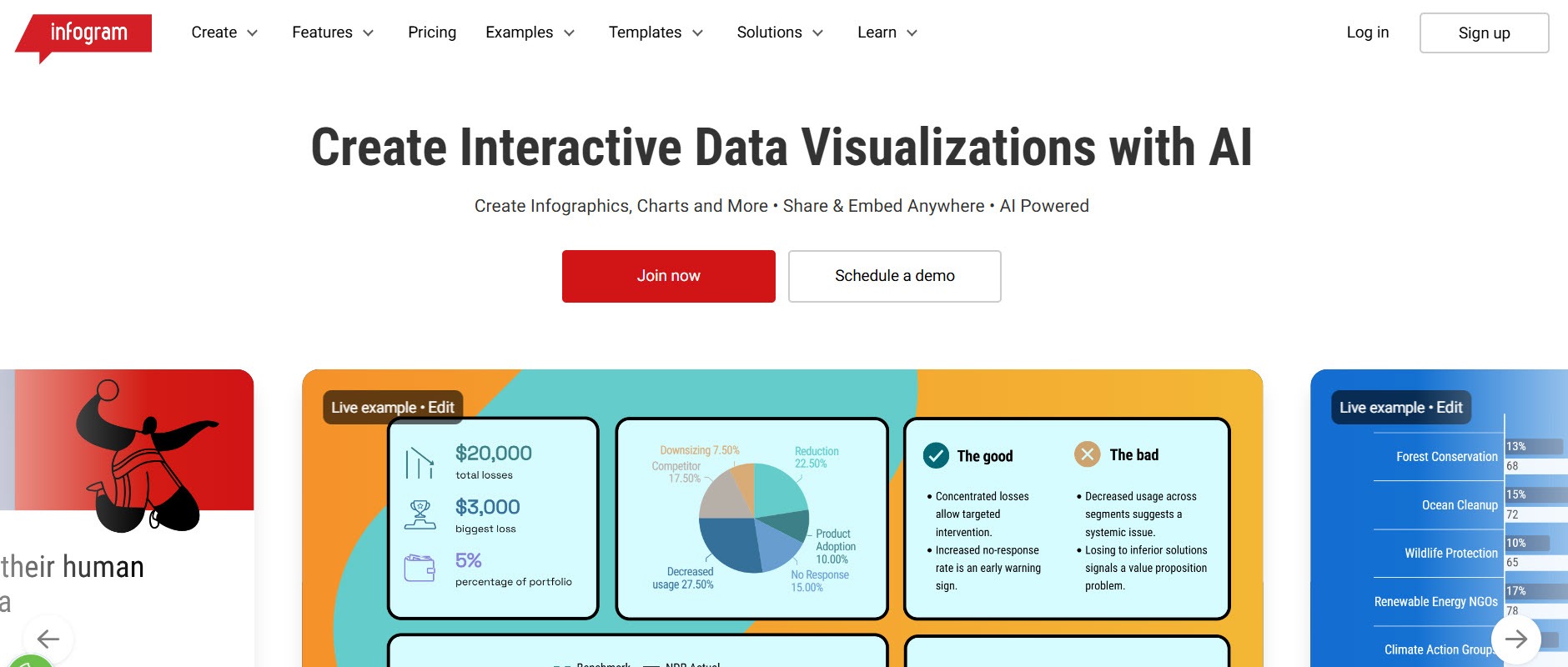
Its AI tools can analyze supplied data and suggest suitable chart types. Users aren't locked into that initial recommendation: charts can subsequently be changed and customized, including their colors, axes, formats, values, and fonts.
Infogram's AI-generated projects can also be opened in its editor to modify themes, text, charts, images, and animations. That makes it especially relevant when control over the data presentation matters more than elaborate graphic-design capabilities.
4. Canva: Best for Brand Consistency
- Founded: 2012
- Headquarters: Sydney, Australia
Canva's broad design environment becomes particularly useful when infographic customization needs to stay consistent with other branded content.
Its Brand Kit lets users establish brand colors, fonts, logos, imagery, graphics, and brand templates for reuse across designs. Canva also provides Resize and Magic Switch for adapting existing work to different formats.
For teams, that can be more valuable than adjusting every element independently. Control isn't always about having more sliders and settings. Sometimes it's about defining the correct visual system once and making it easier for everyone to follow.
That makes Canva particularly practical when infographics sit alongside social posts, presentations, documents, and other recurring brand assets.
5. Creately: Best for Diagram Control
- Founded: 2008
- Headquarters: Melbourne, Australia
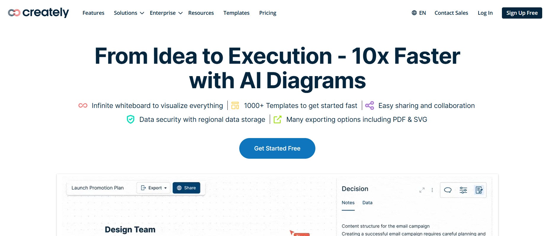
Creately comes from diagramming and visual collaboration rather than conventional graphic design. That makes it particularly useful when the structure of the information needs more attention than decorative styling.
Processes, systems, workflows, and interconnected concepts often require precise control over relationships between individual elements. Creately's visual workspace is designed around constructing and rearranging those connections.
For infographic creators, the distinction is useful. Rather than trying to force a complex process into a fixed visual template, users can establish the underlying diagram first and refine how the information relates. This makes Creately a stronger fit for structural visuals than image-led infographic design.
6. Genially: Best for Interaction Control
- Founded: 2015
- Headquarters: Córdoba, Spain
Genially adds a form of control that static infographic editors generally don't: the ability to influence how audiences interact with the information.
Its interactive approach is useful when creators want supporting material to appear through audience actions rather than displaying every detail simultaneously. Animation and interactive elements can therefore become part of the information hierarchy itself.
This is particularly relevant for training, education, presentations, and digital explainers. Instead of only deciding what the infographic looks like, creators can make decisions about how its information is revealed.
That additional dimension won't matter for every project, but it can be valuable when the final infographic is designed primarily for screens rather than print or static downloads.
7. DesignCap: Best for Template Customization
- Founded: 2006 (PearlMountain)
- Headquarters: Hong Kong
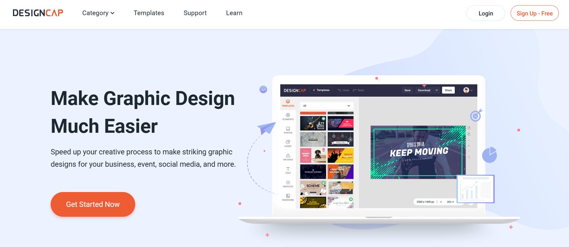
DesignCap provides a more conventional form of control: starting with an existing template and adapting it to the project.
Users can replace the supplied content and customize elements such as fonts, imagery, shapes, colors, and illustrations. This approach works particularly well when the overall structure of the infographic is already suitable and the main task is making it your own.
There's less emphasis on handing creative decisions to a generator. Instead, the template establishes a visual framework that users can modify.
For lists, comparisons, timelines, and other predictable formats, that can provide a useful balance between the rigidity of a finished design and the additional work involved in starting from a blank canvas.
8. Easelly: Best for Focused Infographic Editing
- Founded: 2015
- Headquarters: Seattle, WA
Easelly has deliberately narrowed its focus to infographics, having shifted away from being a broader graphic-design platform.
That specialization can be useful for creators who don't need a large ecosystem of unrelated design formats. Instead, the editing experience is centered on the visual structures and assets commonly needed for infographic creation.
Its narrower remit also makes Easelly worth considering for occasional users who want control over their infographic without navigating a more expansive creative suite.
The platform additionally offers professional design services. That creates another option when a project needs more customization than a team wants to handle internally, while keeping infographic creation at the center of the offering.
9. Snappa: Best for Straightforward Visual Editing
- Founded: 2015
- Headquarters: Ottawa, Canada
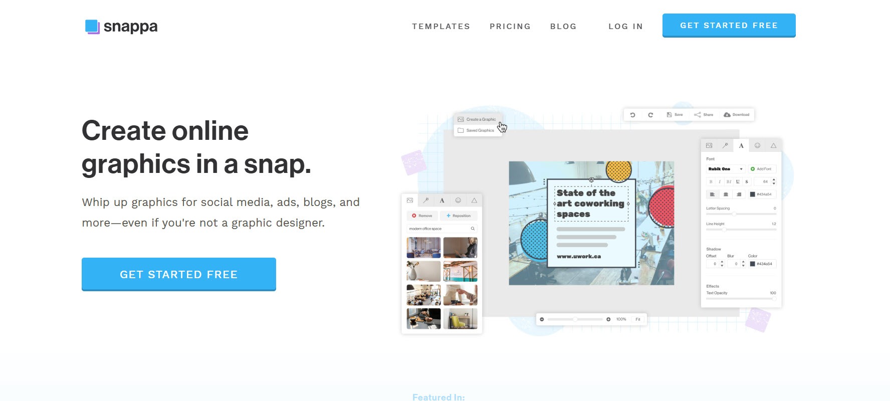
Snappa is designed around accessible graphic creation for people who don't necessarily have professional design experience.
Its appeal in a control-focused comparison is simplicity. Not every creator needs granular data visualization settings, complex interactive behaviors, or advanced diagramming. For straightforward marketing infographics, being able to adjust the essential visual elements without navigating an extensive professional editor can be an advantage.
Snappa is also a broader marketing-graphics platform, so infographics can sit alongside social media visuals, blog graphics, and advertising assets.
It makes the most sense when the desired level of control is practical rather than highly technical: enough customization to produce a distinctive asset without adding unnecessary complexity.
10. Miro: Best for Collaborative Visual Control
- Founded: 2011
- Headquarters: San Francisco, CA
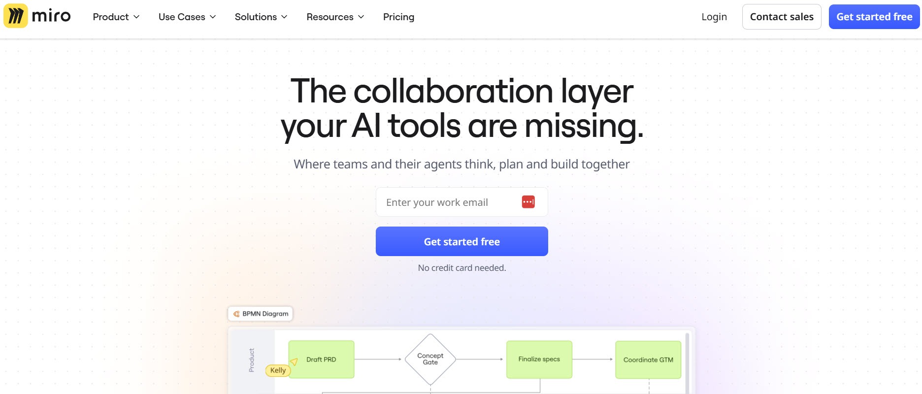
Miro approaches visual creation from a collaborative workspace perspective rather than positioning itself primarily as an infographic editor.
That makes it relevant when several people need to shape the information before the final visual is produced. Teams can organize ideas, map relationships, develop diagrams, and work together on visual structures in a shared environment.
This is especially useful for complex explainers where determining the content hierarchy is a collaborative exercise. Researchers, strategists, marketers, and designers can contribute to the same visual workspace rather than passing static drafts between one another.
Miro is therefore less suited to highly polished, template-driven infographic production than dedicated design tools, but stronger when collaborative control over the underlying information is the priority.
Frequently Asked Questions
Quick answers related to this article from PerfectionGeeks.
1. What should you look for in an infographic generator?
2. Why is post-generation editing important in infographic creation?
3. Which infographic generator is best for post-generation editing?
4. Which infographic generator is best for data visualization?
5. Can AI-generated infographics still maintain brand consistency?
Conclusion
AI can remove much of the groundwork from infographic creation, but a fast first draft shouldn't come at the expense of creative control. The strongest generators let you decide what happens after the initial design appears.
Prioritize the controls that matter for your work, whether that's refining data visualizations, maintaining strict branding, adjusting layouts, or creating interactive elements. The right balance is simple: let the generator handle repetitive work while keeping the important creative decisions in your hands.

Devanshi specializes in SEO-focused content for AI, web, and mobile app development. She crafts user-centric, search-optimized content that enhances online visibility, strengthens brand authority, and supports sustainable organic growth through strategic content marketing and audience-focused communication.