6 Best HTML5 & CSS3 Responsive Frameworks for Your Website - PerfectionGeeks
The 6 Best HTML5 and CSS3 Responsive Frameworks
March 28, 2023 06:10 PM
When you build a website that uses a grid-based format with media queries, images, and other elements that seamlessly adjust to the dimensions of any gadget, then you're creating a website with an adaptive design. Responsive designs are gaining popularity not only because mobile devices generate more than half of the world's online traffic but also because mobile commerce is a 3.56 trillion dollar industry today.
If you want to increase your revenue and gain a competitive edge, you must adopt a mobile-first approach to designing your website and implement the best frameworks.
Generally, there are two kinds of responsive frameworks: front-end and back-end. The main difference between the two is that the framework is employed to create a website's application or presentation layer. In this article, we will review responsive front-end frameworks in more depth.
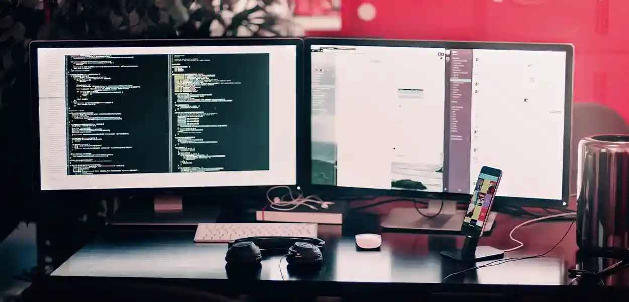
Responsive front-end frameworks are a blend of HTML, CSS, and JavaScript. In essence, they are themes that provide a standards-compliant, user-friendly, and flexible foundation on which to construct your site. Many of the frameworks listed are open source, which means they are accessible for download for free and swiftly adaptable. We've put together an extensive list of the most effective ones that you can choose from. However, remember that there are numerous open-source frameworks that you could consider.
Mobile devices are now the primary way people access the web. It's not a reason to be surprised by the fact that user-friendly HTML5 front-end-based frameworks have become highly sought-after. In fact, as per Search Engine Watch, nine out of 10 people evaluate websites based on the degree of responsiveness their designs have.
If you haven't completed it, now is the best time to prioritise mobile-friendly design in your web design strategy. Below are some of the most well-known mobile-friendly HTML5 front-end frameworks that could help you with this.
The foundation can be described as the top-level, advanced, and flexible front-end structure. With this HTML5 Responsive Frameworks system, you could begin building websites optimized for devices with small screens first. It's designed to be an adaptive and responsive site.
It assists you in assembling rapid and flexible websites and web applications. It delivers excellent website execution and allows you to maintain the server configuration easily. It assists you in starting your new ventures.
The UI kit Framework is a light and private front-end structure ideal for web interfaces' rapid and dynamic growth. UI kit offers a comprehensive collection of HTML, CSS, and JS segments that are easy to work with, modify, and expand.
Its light semantics and flexible structure will help power the upcoming age of responsive websites.
One of the most innovative kids on the block, HTML5 KickStart is an upwardly inclined and mean-looking package comprising HTML, CSS, and JavaScript documents that will reduce the UI designer's many work hours.
The skeleton is an easy front-end framework that can be used to build HTML5 websites and other applications. It is a collection of CSS records that assist you in creating sites that look stunning regardless of screen size. It looks at three core standards: responsive networks, flexibility, fast starts, and freethinker style.

Generally, responsive CSS frameworks are usually added to the front-end frameworks of all websites or sites. They are CSS frameworks with various components like clean code, responsive designs, a responsive slider, cross-program similarity, built-in animations, catches, and more that the developers employ. By using this accessible CSS framework, creating projects within the site can be an incredibly efficient and straightforward task. In addition, if you include JavaScript or jQuery plugins into these frameworks, it's possible to make various effects.
The most appealing aspect of Kube is that it's straightforward to set up and customise. It is easy to create an online site that has many available options. It does not mess up the pixels and is suitable for every smartphone and tablet.
Blueprint promises to reduce the development of your site by offering easy-to-use matrices, flawless textual styles, and useful plugins. There are editors, tools, and layouts that will assist you with every stage of preparing your site. You can reset the site to eliminate any inconsistencies between the software.
Semantic-UI is an excellent design for an interactive 3D website. It gives creators flexibility by providing unique state variables and creating an older framework using just a few lines. There are approximately 3000 CDSS variables that can be utilised in any system.
It provides a few CSS modules to build the system, especially for mobile devices. It has minimal styles and flexible frameworks, tables, and menu layouts. It is a variation of Normalize.css and is suitable for any size screen. You can create fast and heavy websites with it.
Bootstrap is an open-source CSS system created using the powerful Bootstrap 3. Its purpose is to build an excellent web layout that is faster, easier, less demanding, and less tedious. Therefore, the UI Kit includes an excellent PSD client interface package that you can utilise for your website, iOS, or Android venture.
Inuit.css is another fantastic CSS responsive framework focusing on mobile-first web design approaches. It also lets you make all the configurations. While other frameworks have their own outline CSS style, Inuit.css does not. Instead, it is designed to meet expectations concerning the (Object Obscured CSS)OOCSS way, a simple, adaptable, and feasible method for creating reused CSS.
Its flexible front-end structure will speed up web development with a 960px wide holder. The compartment could be divided into 16, 12, and even 24 sections to make a more streamlined layout of the substance.
In light of Google's Material Design standards, Materialize is an up-to-date, responsive front-end system. It is an excellent solution for users who wish to implement your site's Material Design look and feel on their website with minimal difficulty. It has the outline of a card, progressively stretching influence activities and dragging the flexible menu, plus a lot more.
Jeet is a fast and flexible front-end framework available at present. It allows you to build matrices naturally and cleanly and is the basis for all the current and older programmes.
The Metro UI features twelve grid-based designs powered through Microsoft's Windows 8 Metro-style interface. It's not difficult to use, is stylish, and includes various standard elements such as a catch, tile menu, date picker, and more. It also has a News Portal format to get you started quickly.
TopCoat is a flexible front-end structure developed by the Adobe group to create web-based applications quickly. Every element in TopCoat is designed to be advanced for execution requirements. In addition, it provides the flexibility to change, open-source text styling, and a PSD UI Kit.
Less Framework is a CSS front-end framework that allows you to build responsive websites. It is focused on creating a clean and easy grid layout and includes 3 typography options and 4 layout presets, including mobile, tablet, default, and wide mobile. All of them are based on the same grid.
The purpose of the Less Framework is to create uniformity and make web design using different design styles more productive. Because each layout is based on the same grid, it allows users to reuse elements between layouts without altering the layouts too often.
Choose one of these adaptable frameworks based on your requirements. Frameworks will undoubtedly save lots of time!
At PerfectionGeeks, we specialise in building top-quality applications using WordPress with various tools and frameworks. We are also regarded as a website development company in the USA. If you're searching for an innovative and high-end solution for technology that automates and scales all your business processes, look into the services and tell us about them.


Strategy
Design
Blockchain Solution
Development
Launching
Testing
Maintenance
Contact US!

Plot 378-379, Udyog Vihar Phase 4 Rd, near nokia building, Electronic City, Phase IV, Udyog Vihar, Sector 19, Gurugram, Haryana 122015
Copyright © 2026 PerfectionGeeks Technologies | All Rights Reserved | Policy
Contact US!
Plot 378-379, Udyog Vihar Phase 4 Rd, near nokia building, Electronic City, Phase IV, Sector 19, Gurugram, Haryana 122015
Copyright © 2026 PerfectionGeeks Technologies | All Rights Reserved | Policy


